Getting Started Prototyping The Interface for Tracepaper
Building an intuitive and visually attractive front-end is, if nothing else, a creative process. We not only have to look into how we want the application to look and feel, but also how we want our users to use it. When prototyping a front-end for a completely new application, where we are still learning what the application is supposed to be and how we want users to interact with this application, it can be very difficult to get started.
Now, building an amazing generator that can flawlessly translate (visual) models to working code in a serverless environment is one challenge. The other one has more to do with how users experience this generator. One way to build a font-end is to stick to the technicalities of the generator and translate this into a working front-end. This is something that I see happen quite often when a back-end developer builds an interface for their application. And, to be honest, I used to do it like this too. The problem with this is that your technical implementation doesn't necessarily reflect how users are going to be using your application. In other words, we need to build interfaces that guide our users through a complex application, making it all feel incredibly simple and sophisticated.
Bo and I took a lot of time talking about how we see the concepts of our generator in the hands of our users. Even though the generator is now on its 4th iteration, our ideas of what our users need to be able to do haven't really changed. And since the generator is now almost ready for our first MVP, it is now time to take a deep dive into the user interaction of Tracepaper. A few weeks ago we started with a recap and alignment session to figure out how we want Tracepaper to behave. In this meeting, we discussed everything from a high-level view. We are definitely not talking about how it looks or how to make it fancy. At this stage, all we really care about is defining the user interaction.
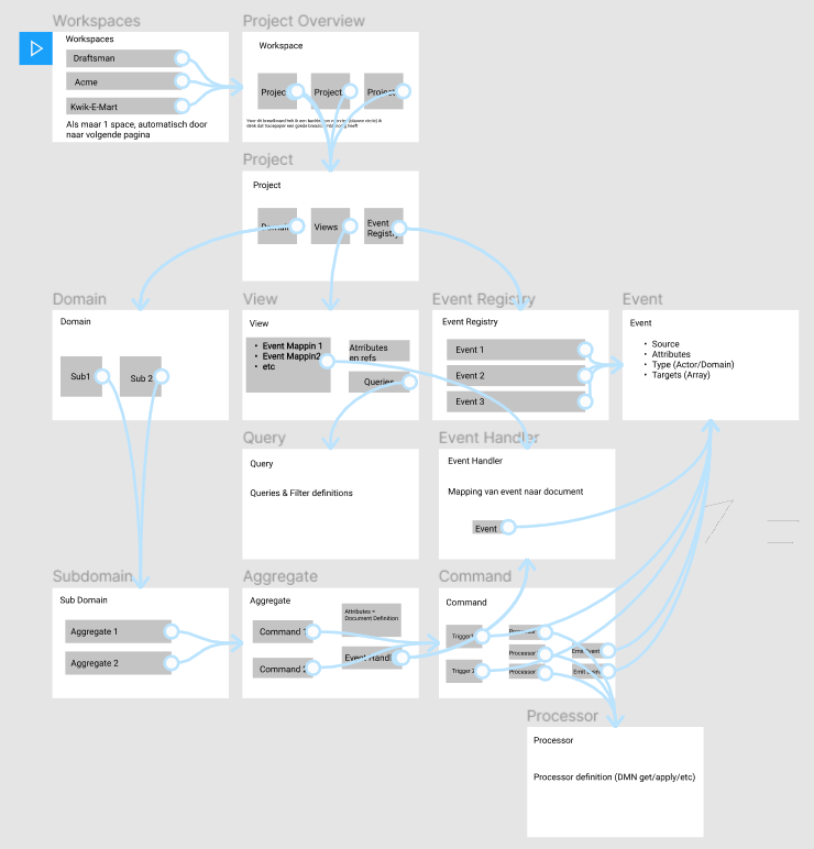
After finishing this meeting, Bo took the time to draw up a very high-level Breadboard. This is a simple technique, borrowed from our friends at Basecamp, that we can use to give insight into how a user might progress through an interface. This gives both of us a familiar starting point when discussing the user interaction and we can easily communicate about it in the future.

The snippet above is part of our Breadboard for Tracepaper. As you can see, it is very simple and it doesn't even look all that pretty. But of course, that was never the intention. We can very quickly see how a user might logically progress through Tracepaper. From Projects to Domains and all the underlying Aggregates with their Commands. Each view is set up so the user sees exactly what they expect to see, with the ability to drill down into more specific information about their domain.
In this phase of the development cycle, we want to be able to quickly put something together, without fully committing to a set of design principles. Well, to be completely honest, we didn't follow our own advice on this. Quite some time ago we actually started with the look-and-feel of the application. Choosing our branding color and designing all core components of the Tracepaper front-end. This resulted in a bunch of small components, like Buttons, Alerts, Badges, Modals, and Notifications all optimized for reuse. This happened organically for us because we spent a lot of time prototyping the generator and still wanting to get a head start on the front-end for Tracepaper. Even though I really don't believe this is the best way to get started, it does allow us to rapidly build a prototype for our platform as all the building blocks have been created...
I personally think it's better to get the user interaction down and focus on the user experience. We can always make the application prettier, but changing the user interaction takes a lot more work. Everything we do from this point onward, regarding front-end development, will be based on our Breadboard, where we focus on the user interaction with our platform. When the user interaction has to change, the Breadboard should change, and then we will change the front-end accordingly.
In this post, I haven't spent any time on what front-end technology we have decided to use and how we do our prototyping. I will save this and more details about our design strategy for the next post. I hope to see you there.


