

Designing Reference Cards and The Power of Utility-first CSS
When we started thinking about Tracepaper and how it should look, we decided that we would want the final product to look very minimal and professional. Our vision is to build a product that is so easy and clear to use, there would be no need for how-to guide or manual.
Grayscale is The New Color
After creating a Breadboard outlining how Tracepaper should work, we shifted our focus to the look-and-feel of the application. When designing a new modern application, there are a few important principles we need to keep in mind. We have already talked about creating an interface for the end user, not the back-end you (may) have already built, in a previous post. Another, very practicle, principle is to start designing in grayscale. Since we have little constrast to draw the users attention to important elements on a page in grayscale, we have to be very concious of the sizes of each element and how they are positioned in relation to each other. We will most likely end up with a very minimal looking design already. This will function as a solid base we can then use to introduce color into the design. Event though we love Grayscale colors, we still want Tracepaper to feel like an application by Draftsman, a little bit of color will do create that feeling for us.
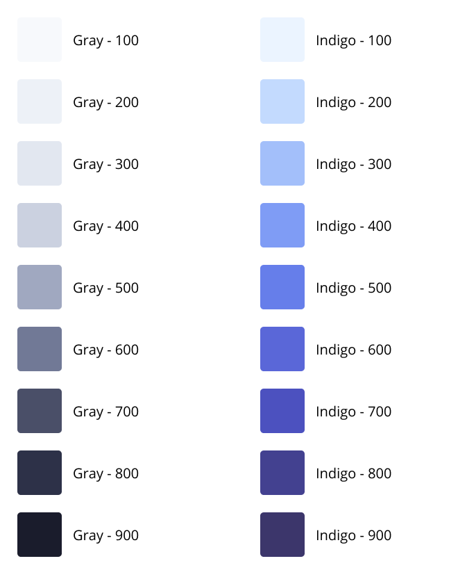
For Draftsman we decided early on that our brand color would be Indigo. This color in particular is a mix between blue and purple and work really well visually on screens. And since we want Tracepaper to look very minimal and clean, we naturally gravitated towards a monochromatic color scheme. When working with a monochromatic design, we can still use more than one color, as long as it originates from the brand color, in our case indigo. This effectively means that we have created nine different shades of indigo, some lighter and some darker, that we can use to make the Tracepaper a well put together application while keeping the minimalistic characteristic.

The main takeaway would be that layout and spacing is more important for hierarchy and guiding users attention than using color.
Design References are Essential
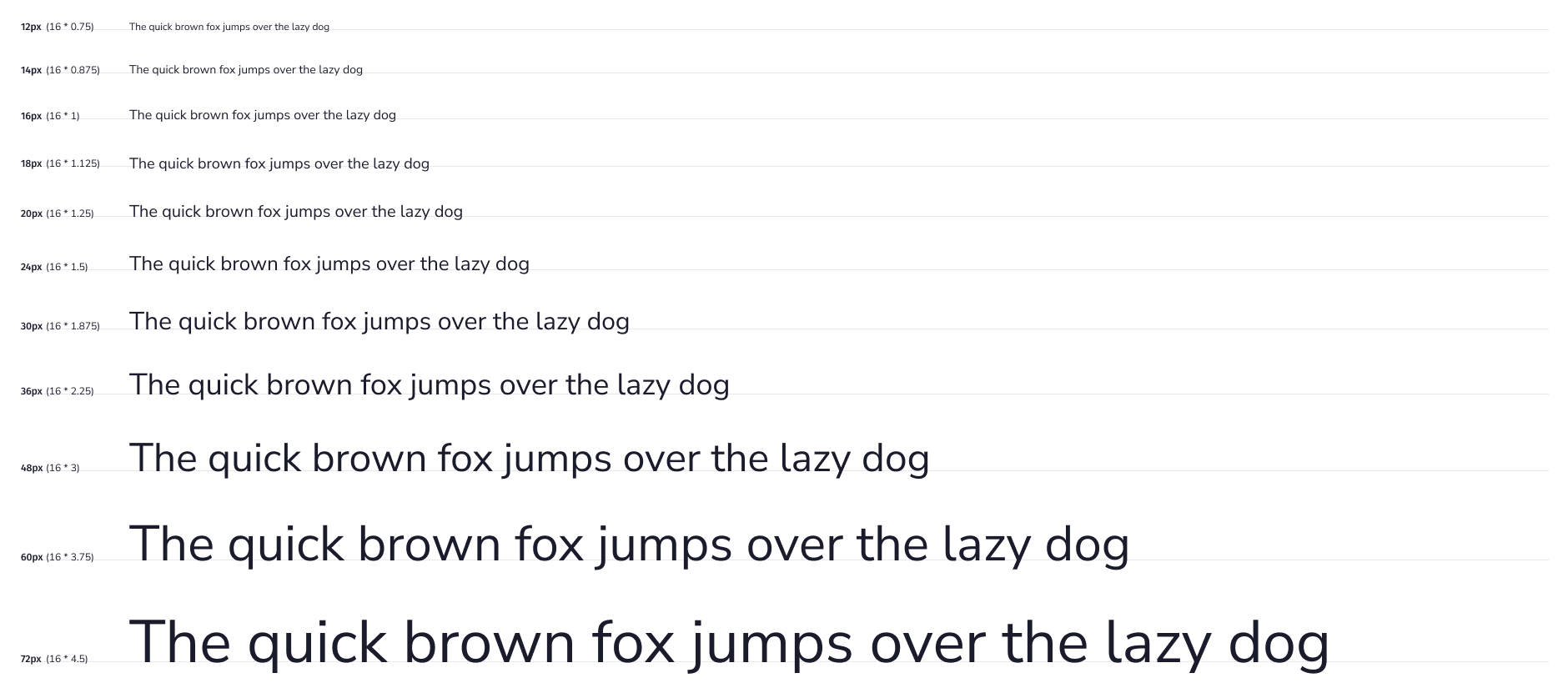
When desiging a new application, we have to make many different choices. The branding color and color scheme is one of them. Others might be the fonts we used, the font styles, sizes or weights. Maybe we even have different border or shadow presets we want to use throughout the design. If we want to have professionally looking design, we can't simply pick colors or font sizes by hand. It wouldn't be long until we have a design that uses 33 different font sizes and colors, when they actually could have been the same as others we have used. This is were Design Reference Cards come in.
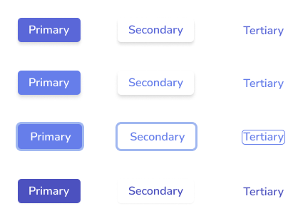
We want to create a Design Reference Card that contains all choices we have made, so we can reuse these presets throughout the entire design when we need them. By making certain decisions up front and expaning the Design System when we make new choices, we can get started creating what really matters that much faster. Desinging a new page for an application is just that much faster, when all the constraint have been set. It's almost as if all we have to do is apply what we already have. For example, we want a lighter color of gray for this paragraph. To achieve this, we can look at the design reference and pick the color and font size we want for that particular paragraph and it'll fit into the rest of the design like a glove. By working with these references we are working towards a design that looks very well put together.
For doing this we decided to use Figma. Figma has support for Design Systems, so we can reuse our font styles, colors, border and shadows styles. As well as creating different components we can reuse, such as buttons, form elements, modals, et certera. On top of that Figma has a really usable free tier and it's incredibly easy to use. We don't even use all the features Figma has to over, so we know it could serve us well for the years to come.
The Cycle of Design to Code
It's important to not fall into the trap of design upfront and write code later. You want to continually cycle between the two, so you can build and test what you have designed. And since we can design new components or pages very quickly in Figma. It would be nice if we could build them in code pretty fast as well.
Utility-first CSS
A few years ago Adam Wathan started writing about his ideas of how CSS should be used in web development. He specifically talked about treating CSS as utilities for your HTML and how this would be superior to creating full-on stylesheets. The principle of Separation of Concerns in Software Engineering, can be applied to HTML and CSS as well. When we use a framework such as Bootstrap, both HTML and CSS are interconnected. The HTML has to be written in such a way the pre-defined CSS classes can be used. When the CSS changes, the HTML has to change too, and vice versa. This can become quite the nightmare for larger projects. With Adam's concepts of Utility-first CSS, we can use utility classes , such as pre-defined paddings, margins, sizes and colors, which we can then apply onto HTML elements. Now we don't have a tight coupling between HTML and CSS anymore and the HTML is responsible for applying the correct utilities to create a design.
Fast forward a couple of years and we now have Tailwind CSS. A utility-first CSS framework by Adam Wathan that generates all CSS utility classes you could ever think of needing. In this approach, it is essentially unnecessary to write any custom CSS for your application. It is more difficult to use than Bootstrap, because you need to know how CSS actually works. But if you do know CSS well, this framework is insane. The utility-first approach give you a set of reusable utilities that make it easier to build a consistent and standardized design, just like we talked about when building a Design System in Figma. The framework isn't opinionated and allows you to style your application however you want.
The beauty of Tailwind CSS specifically, is that we don't have to write or maintain any actual CSS. Its library of utilities is so well defined, that we can create anything we need using these default utilities. We used Tailwind CSS to convert our Design System elements from Figma into reusable components in code.
If you have ever seen an HTML page using Tailwind CSS, you can see that there are a lot of classes required on each element to style it just how you want it. For Tracepaper we want to make sure that we reuse as many components as possible. Since we have already decided to use VueJS, we have the ability to create reusable components whenever we see we need to repeat a certain element. A good example for this are modals or buttons. These are repeated in a lot of places in the application. This means that the large HTML files are now created once, and then never to be looked at again, because VueJS makes it easy to import any component in your web page.
Using Tailwind CSS as a Design Tool
By converting our Design System from Figma into Code using Tailwind CSS, we quickly realized that we could use Tailwind as a design tool as well. It would roughly take me the same amount of time to draw an idea up in Figma versus writing the code directly. This is why, after we has established a Design System for Tracepaper, we simply started designing and experimenting directly in code.
At this time we are not sure if this is how we want to keep working, but for now - in our startup phase - it makes a lot of sense for us to directly implement ideas. I'm sure that once we have released version one of Tracepaper, we will return to Figma more often to draw up new concepts and ideas.